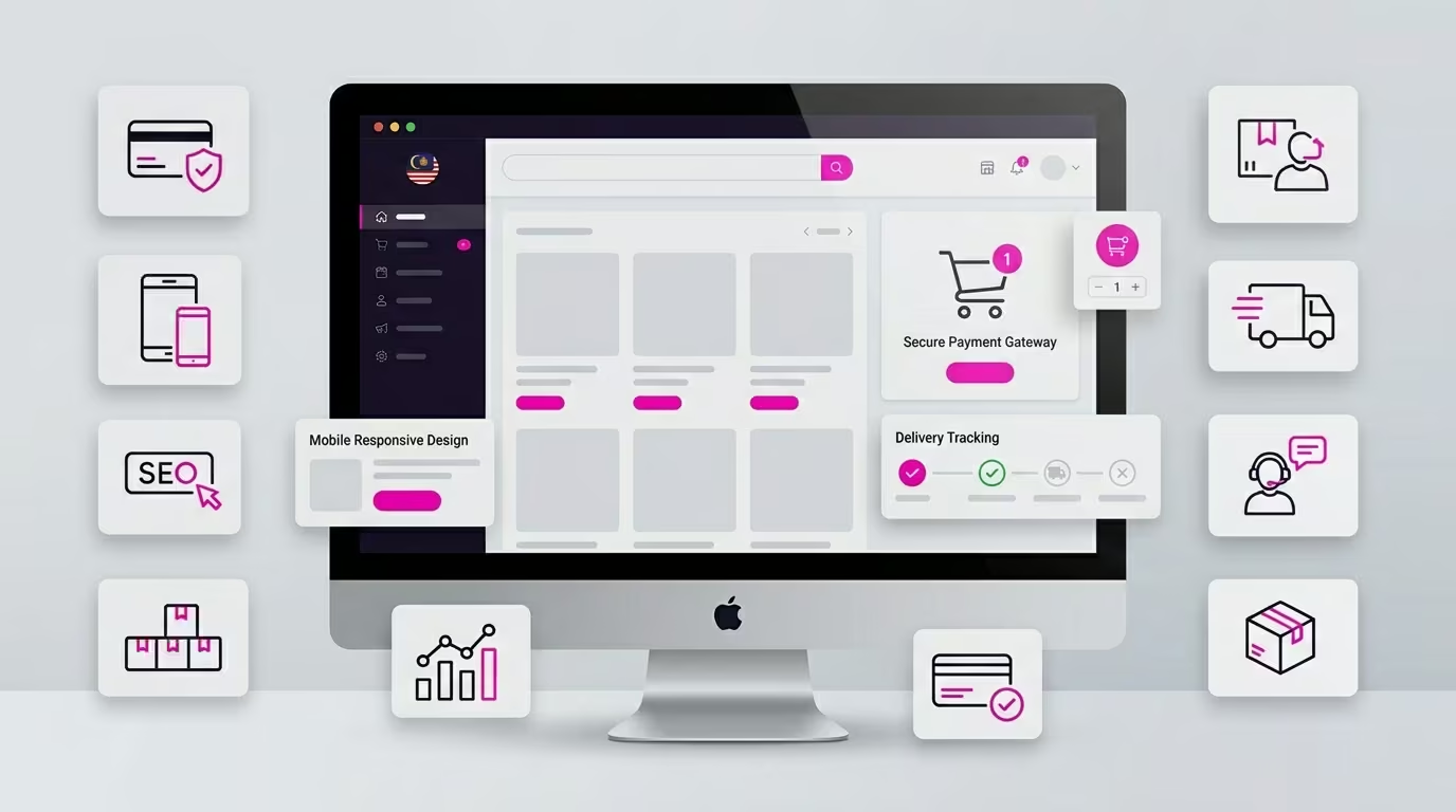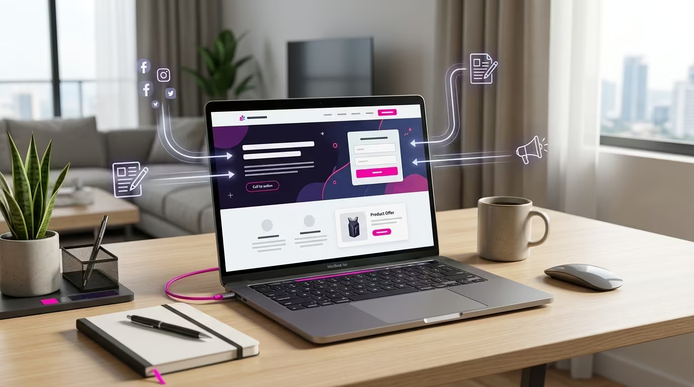

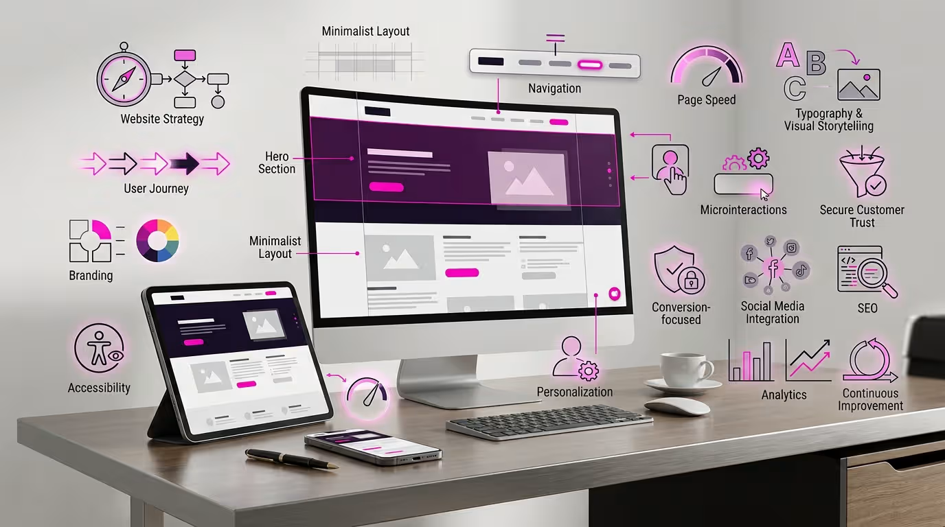
A business website may look professional at first glance and still fail to support the business effectively. Visitors may struggle to understand the services, find important information or decide what action to take next. In many cases, the problem is not the absence of attractive design, but the lack of a clear structure connecting design choices with customer needs and business goals.
The most useful web design ideas improve more than appearance. They help strengthen brand credibility, simplify the customer journey, support mobile users, improve search visibility and create clearer paths towards enquiries, quotation requests, bookings or purchases.
This guide explores 17 practical web design ideas that businesses can use when planning a new website or improving an existing one. Each idea focuses on creating a website that is visually appropriate, easy to use and capable of supporting wider marketing and business activities.
1. Start With a Clear Website Purpose and Conversion Goal
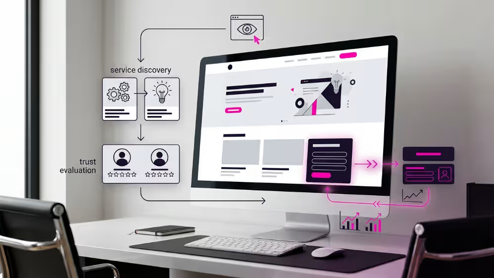
Before choosing colours, layouts or interactive effects, determine what the website needs visitors to do.
A corporate website may need to generate quotation requests, explain complex services, support a sales team or strengthen the organisation’s credibility. An e-commerce website may focus on product discovery and purchases, while a campaign landing page may be designed around one specific registration or enquiry action.
Without a defined purpose, a website can become visually attractive but commercially unclear. Visitors may browse several pages without understanding the next step or why they should contact the business.
Begin by identifying one primary conversion goal for each important page. Depending on the business, this may include:
Submitting an enquiry form
Requesting a quotation
Calling the company
Starting a WhatsApp conversation
Booking a consultation
Registering for an event
Purchasing a product
Downloading a company profile
The goal should then influence the page structure. A service page intended to generate enquiries may begin with a clear value proposition, explain the customer’s problem, present the service solution, provide evidence of capability and conclude with a visible call to action.
Calls to action should also match the visitor’s level of readiness. A visitor researching an unfamiliar service may prefer to view a process, case study or frequently asked question before requesting a quotation. Visitors who already understand the service may be ready to contact the business immediately.
This is why effective website planning should consider both the final conversion and the information visitors need before they feel confident taking that step.
A practical question to ask during planning is:
What should the visitor understand, trust and do after viewing this page?
The answer helps prevent unnecessary design elements and keeps the page focused on measurable business outcomes.
2. Design Around Your Target Audience and Customer Journey
A website should be organised around the questions, concerns and decisions of its target audience.
Businesses often structure websites according to internal departments, technical terminology or a long list of services. This may reflect how the company operates, but it does not always match how potential customers search for information or evaluate a provider.
A better approach is to map the customer journey from the visitor’s perspective.
Consider the questions a potential customer may ask:
Does this company provide the service I need?
Does it understand my industry or problem?
What is included in the service?
How does the process work?
Can I trust the company?
What evidence supports its claims?
How do I request more information or a quotation?
The website structure should answer these questions in a logical order. Important information should not be hidden behind complicated menus, vague headings or long blocks of technical content.
For example, a professional service page may guide visitors through the following journey:
Identify the customer’s problem or objective.
Explain the service and its practical value.
Describe what is included.
Present the working process.
Show relevant experience, credentials or customer evidence.
Address common concerns.
Provide a clear next step.
Different visitors may also enter the website at different stages of the buying journey. Some arrive through the homepage, while others land directly on a service page, blog article, campaign page or product page from Google, social media, advertising or a referral.
Each important page should therefore provide enough context to help a new visitor understand the business without requiring them to return to the homepage first.
Good customer-journey design also considers different levels of readiness. A visitor who is still researching may need educational content or a comparison guide. A visitor who has already shortlisted the company may look for pricing, project examples, testimonials or a direct contact option.
Applying fundamental web design principles can help businesses create a clearer hierarchy, more consistent navigation and a more intuitive experience across these different journeys.
The objective is not to force every visitor towards an immediate enquiry. It is to remove confusion, build confidence and make the appropriate next action easy to find.
3. Match Your Website Design to Your Brand and Industry
A website should look appropriate for the business it represents.
Design choices that work well for a technology startup may not suit a legal firm, healthcare provider, construction company or corporate consultancy. The layout, colour palette, typography, imagery and tone should support the level of trust, professionalism and clarity expected within the industry.
This does not mean every business in the same sector should use an identical design. The objective is to balance familiarity with distinction.
Visitors should quickly recognise the nature of the business while also understanding what makes the company different from its competitors.
A professional brand-aligned website should maintain consistency across:
Brand colours
Logo usage
Typography
Photography and illustrations
Icons and graphic elements
Writing style
Calls to action
Page layouts
Forms and buttons
Consistency makes the website feel more credible and established. When colours, fonts, image styles and messaging change significantly between pages, visitors may question whether the website is current, properly maintained or professionally managed.
Industry expectations should also influence the amount and type of information presented.
For example, a corporate consultancy website may need detailed service explanations, team profiles, credentials and case studies. An online store may need strong product photography, category filters, delivery information and a simple checkout experience. A contractor or supplier website may benefit from project galleries, product specifications, certifications and quotation request options.
Businesses should also avoid choosing visual trends simply because they appear modern. Oversized animations, experimental navigation or unconventional typography may attract attention, but they can weaken clarity when they do not suit the audience.
A stronger approach is to ask:
Does this design choice reinforce the brand, help visitors understand the business or make the next action easier?
When the answer is no, the feature may be decorative rather than useful.
The best website design is not necessarily the most unusual. It is the design that accurately represents the company, supports customer expectations and makes the business easier to trust.
4. Use a Modern Layout With Strategic White Space
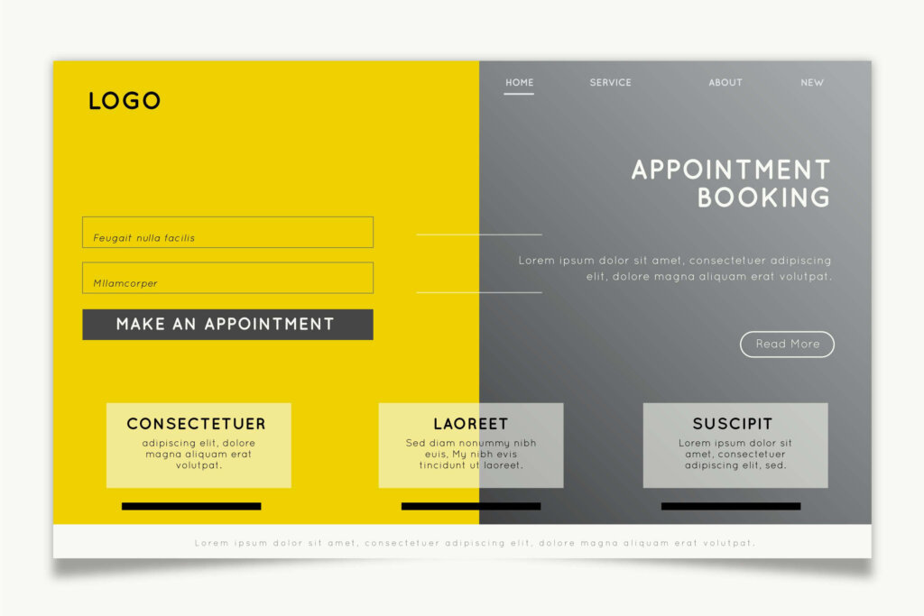
A modern website does not need to fill every available space with text, images, buttons or decorative elements.
Strategic white space gives each section room to breathe. It separates ideas, improves readability and helps visitors recognise which information deserves their attention first.
White space does not always mean a completely white background. It refers to the unused space around headings, paragraphs, images, forms, buttons and other page elements.
When spacing is too tight, a website can feel crowded and difficult to scan. Visitors may struggle to distinguish between service descriptions, supporting evidence and calls to action. This is especially problematic on mobile devices, where limited screen space can make a cluttered layout even harder to use.
A well-spaced layout can help businesses:
Make important headings easier to notice
Improve readability across long service pages
Separate one message from another
Draw attention to calls to action
Present images and project examples more effectively
Create a more professional and confident appearance
Reduce the mental effort required to understand a page
The layout should also establish a consistent rhythm. Similar sections should use consistent margins, padding, heading sizes and content widths throughout the website.
For example, a corporate service page may use a spacious opening section, followed by clearly separated blocks for the service overview, benefits, process, evidence and enquiry form. Visitors can then scan the page quickly without losing their place.
Businesses should avoid treating empty space as wasted space. Adding more content to every gap does not necessarily make a page more informative. It may weaken the hierarchy and make important messages less visible.
Modern layouts also benefit from clear content boundaries. Background changes, cards, columns and subtle section dividers can help organise information, but they should be used consistently. Too many visual containers can make the page feel fragmented.
The objective is to create enough structure to guide the visitor without making the design feel restrictive.
A useful test is to view the page from a distance or scroll through it quickly. The main headings, key messages and calls to action should remain easy to identify even without reading every sentence.
Strategic white space supports this clarity by allowing each important element to perform a specific role.
5. Strengthen Your Hero Section With a Clear Value Proposition
The hero section is usually the first major section visitors see when they open a website. It should communicate the business value quickly without forcing visitors to read several paragraphs.
A strong hero section normally answers three questions:
What does the business provide?
Who is the service for?
What should the visitor do next?
When these answers are unclear, visitors may leave before exploring the rest of the website.
Generic headlines such as “Welcome to Our Website,” “Your Trusted Partner” or “Providing Quality Solutions” do not explain enough. They could apply to almost any company and provide little reason for a visitor to continue.
A more effective headline describes the service and the business outcome clearly.
For example, instead of:
Solutions That Help Your Business Grow
A web design company could use:
Professional Business Websites Built to Strengthen Credibility and Generate Enquiries
The supporting sentence can then add useful context, such as the target market, service scope, location or primary advantage.
A conversion-focused hero section may include:
A clear and specific headline
A concise supporting statement
One primary call to action
An optional secondary action
A relevant image, illustration or website preview
A trust indicator where appropriate
The primary call to action should reflect the visitor’s most valuable next step. Depending on the website, this may be:
Request a quotation
Book a consultation
Explore services
View products
Register now
Contact the team
Businesses should avoid placing too many competing buttons in the hero section. When visitors are presented with several actions of equal importance, they may hesitate or overlook the most useful option.
The hero visual should also support the message rather than function as decoration alone. A corporate website may use professional project imagery, a product interface, a service-related photograph or a carefully designed illustration. Generic stock images that do not represent the business can weaken credibility.
The hero section should remain clear on mobile devices. Long headlines, crowded layouts and oversized images may work on desktop screens but become difficult to understand on smaller devices.
A practical test is to show the hero section to someone unfamiliar with the company for several seconds. They should be able to explain what the business does, who it helps and what action they can take.
If they cannot, the message likely needs to be simplified.
6. Simplify Navigation and Improve Visual Hierarchy
Visitors should be able to understand where they are, what information is available and where to go next without having to study the website structure.
Complicated navigation creates friction. Long menus, unclear labels, hidden service pages and too many competing options can make even a professionally designed website difficult to use.
A business website should organise its navigation around the information visitors are most likely to need, such as:
About the company
Core services
Products or solutions
Industries served
Projects or portfolio
Testimonials or case studies
Blog or resources
Contact information
Menu labels should be direct and familiar. Terms such as “Services,” “Solutions,” “Projects” and “Contact” are often more useful than creative labels that require interpretation.
Businesses with many services should group related pages logically instead of placing every page in the main menu. Dropdown menus can help, but they should remain concise and easy to scan.
Navigation should also support visitors who enter through an internal page rather than the homepage. A visitor arriving from Google on a service page should still be able to understand the wider website structure and find supporting information.
Visual hierarchy works together with navigation by showing visitors what to read first.
A clear hierarchy may use:
Larger headings for primary messages
Smaller subheadings for supporting topics
Contrasting buttons for important actions
Short paragraphs and lists for easier scanning
Consistent spacing between sections
Relevant images placed near related content
Distinct styling for testimonials, statistics and calls to action
Not every element should compete for attention. When headings, buttons, banners, icons and images are all equally prominent, visitors may struggle to identify what matters most.
Each page should have one dominant message and one primary action. Supporting content can then guide the visitor towards that action in a logical sequence.
The footer is also part of the website navigation. It can provide secondary links, contact details, business information, service locations, policy pages and access to important resources without overcrowding the main menu.
Navigation must remain practical on mobile devices. Menus should open clearly, buttons should be easy to tap and important contact options should not be hidden behind multiple steps.
A useful navigation test is to ask someone unfamiliar with the website to complete a simple task, such as finding a service, locating a phone number or requesting a quotation.
If the person hesitates, returns repeatedly to the homepage or opens several unrelated pages, the navigation structure may need improvement.
7. Create a Mobile-First Experience for Every Screen
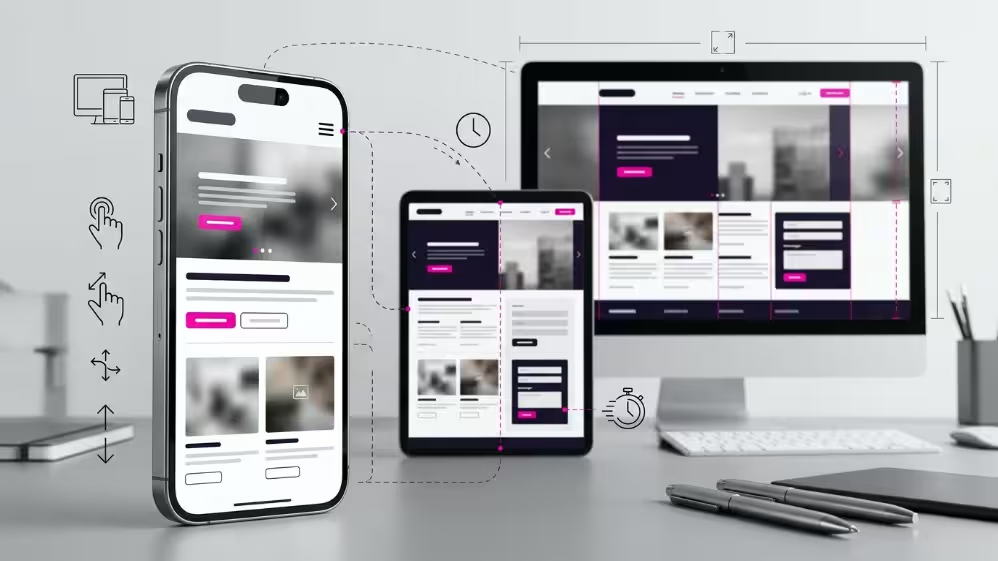
A business website should work properly on smartphones before additional desktop effects are considered.
Mobile-first design does not mean creating a reduced version of the desktop website. It means planning the content, layout and interactions around smaller screens, limited space and touch-based navigation from the beginning.
A website that looks polished on a large monitor may still perform poorly on mobile if:
Headings are too long or oversized
Buttons are difficult to tap
Text is too small to read comfortably
Forms contain too many fields
Images extend beyond the screen
Tables require excessive horizontal scrolling
Menus are difficult to open or close
Pop-ups block the main content
Important information appears too far down the page
These issues can make visitors abandon the website before understanding the service or contacting the business.
Mobile users often visit with a more immediate objective. They may want to call the company, check its location, request a quotation, compare services or send a WhatsApp message. These actions should be easy to complete without unnecessary steps.
A practical mobile layout should prioritise:
A concise headline and value proposition
Readable text with adequate spacing
Clearly separated content sections
Large, accessible buttons
Simple forms
Fast-loading images
Easy-to-use menus
Visible contact options
Consistent calls to action
Content order also matters. Desktop layouts may place text and images side by side, but these elements usually stack vertically on mobile. The sequence must still make sense after stacking.
For example, a supporting image should not appear before the heading or explanation it relates to. Similarly, an enquiry button should not become separated from the service information that gives it context.
Forms should be reviewed carefully for mobile users. Only request information that is genuinely necessary at the first stage. A long quotation form may discourage an interested visitor, especially when it requires detailed responses using a phone keyboard.
Mobile-first design must also consider tap targets. Links and buttons placed too close together can cause accidental selections. Important actions should have enough space around them and remain visually distinct.
Responsive design should be tested across several screen sizes rather than relying only on a website builder’s preview mode. Real-device testing can reveal issues involving menu behaviour, text wrapping, form fields, browser controls and page loading that may not appear during desktop editing.
Businesses should also avoid assuming that mobile visitors are less valuable than desktop visitors. A decision-maker may first discover a company on a phone and return later from a computer, or complete the entire enquiry process from the mobile device.
The objective is to provide the same level of clarity, credibility and functionality on every screen, even when the visual arrangement changes.
8. Improve Page Speed With Lightweight Design and Reliable Hosting
A visually impressive website can still create a poor experience when pages load slowly.
Visitors may leave before viewing the main content, especially when the website contains oversized images, unnecessary animations, heavy scripts or poorly configured plugins. Slow loading can also weaken advertising performance because paid traffic is directed to pages that do not respond quickly enough.
Page speed should be considered during the design stage rather than treated only as a technical task after launch.
Common causes of slow website performance include:
Images uploaded at unnecessarily large dimensions
Uncompressed photographs and background videos
Too many fonts, font weights or icon libraries
Excessive animation and motion effects
Multiple plugins performing similar functions
Third-party tracking scripts loading on every page
Poorly optimised themes or page templates
Outdated software and database clutter
Hosting resources that do not match website requirements
Lightweight design begins by deciding which visual elements genuinely support the page.
For example, a short service animation may help explain a complex process. Several large animations appearing throughout the same page may add little value while increasing loading time and distracting visitors.
Images should be resized for their actual display area and compressed before being uploaded. Modern image formats may also reduce file size while maintaining acceptable visual quality. Mobile devices should not be forced to download the same oversized visual assets prepared for large desktop screens.
Video should be used selectively. Autoplay background videos may create visual impact, but they can consume substantial resources and make important text harder to read. A static image, short embedded video or clickable preview may provide a better balance between presentation and performance.
Fonts can also affect loading speed. Using several font families and many different weights creates additional requests. A consistent typography system with a limited number of variations usually improves both performance and visual coherence.
Reliable hosting is equally important. Even a well-optimised website may respond slowly when its hosting environment lacks sufficient resources, stability or proper configuration.
Hosting requirements should reflect factors such as:
Expected visitor volume
Number and size of website pages
E-commerce functionality
Membership or booking systems
Image and video usage
Database activity
Security and backup requirements
Traffic generated by advertising campaigns
Website maintenance should support ongoing performance after launch. Software updates, broken-link checks, image optimisation, database cleanup and plugin reviews can help prevent gradual performance decline.
Businesses should also test more than the homepage. Service pages, product pages, campaign landing pages and enquiry forms may contain different scripts and content structures that affect loading speed.
Performance testing should be completed on both desktop and mobile connections. A page that loads quickly on an office broadband connection may behave differently on a mobile network.
The objective is not to remove every visual feature. It is to create an efficient website where design, content and functionality load quickly enough to support the visitor’s task.
A fast website feels easier to use, protects the impact of marketing campaigns and gives visitors fewer reasons to abandon the page before taking action.
9. Use Colour and Typography to Guide Visitor Attention
Colour and typography influence how visitors interpret a website before they read every word.
They help establish brand personality, organise information and direct attention towards important content. When used without a clear system, however, they can make a website feel inconsistent, difficult to read or unnecessarily overwhelming.
A practical colour system usually includes:
One primary brand colour
One or two supporting colours
Neutral background colours
A consistent text colour
A distinct colour for important calls to action
Suitable contrast for links, buttons and form elements
The primary colour can reinforce brand recognition across headings, icons, borders or selected background sections. Supporting colours can help distinguish information, but they should not compete equally for attention.
Call-to-action colours should be used consistently. For example, if one colour represents enquiry buttons, the same colour should not also be used extensively for decorative elements. Visitors learn visual patterns as they move through the website, and consistency helps them recognise which elements are interactive.
Colour should also support readability.
Text placed over images, gradients or brightly coloured backgrounds may become difficult to read. Adding a suitable overlay, simplifying the background or moving the text into a separate content area may provide a better result.
Businesses should not rely on colour alone to communicate meaning. Error messages, required fields or status indicators should also include text, icons or other visual cues so the information remains understandable to more users.
Typography performs a similar role in guiding attention.
A clear typography hierarchy normally distinguishes:
Main page headings
Section headings
Supporting subheadings
Body text
Captions
Buttons
Form labels
Heading sizes should show the relationship between sections without creating extreme differences that weaken the layout. Body text should remain comfortable to read across desktop and mobile screens.
Businesses should avoid using too many font families. One font for headings and another for body text is often sufficient. In some cases, a single well-designed font family with several weights can create a cleaner and more consistent result.
Font selection should also match the brand and industry.
A modern technology company may use a clean geometric typeface. A professional consultancy may prefer a more restrained and authoritative style. A lifestyle or creative brand may use more expressive typography, provided readability remains strong.
Decorative fonts should be used carefully. They may work for a short logo treatment or headline, but they are rarely suitable for long paragraphs, forms or important service information.
Typography should also remain consistent across similar page elements. If service headings use one size and weight on one page, the same pattern should continue throughout the website.
A useful test is to scan the page without reading the full text. The visitor should still be able to identify:
The main page topic
The beginning of each section
Important supporting information
The primary call to action
When colour and typography create this hierarchy clearly, they make the page easier to understand and help visitors focus on the information that supports their decision.
10. Tell Your Brand Story Through Purposeful Visual Content
Images, videos and illustrations should help visitors understand the business rather than merely decorate the page.
Generic stock photography may make a website look polished, but it often fails to communicate what the company actually does. When the same office, handshake or smiling-team images appear across many websites, the business can feel less distinctive.
Purposeful visual content can make the organisation more credible by showing:
The team behind the business
Products and equipment
Completed projects
Service delivery
Business premises
Training sessions
Work processes
Customer environments
Before-and-after improvements
Website interfaces or system features
Original photography is particularly useful for established businesses because it provides visible evidence of real operations, people and capabilities.
For example, a supplier website may show product categories, warehouse facilities, delivery preparation and equipment in use. A professional service firm may feature its consultants, workshops, client-facing activities and working process. A manufacturer may use production images, quality-control stages and completed products.
The visual should support the surrounding content. A project image is more useful when placed beside an explanation of the challenge, solution or scope of work. A team photograph is stronger when accompanied by relevant roles or expertise rather than a generic statement about teamwork.
Video can also help communicate information that is difficult to explain through text alone. Suitable uses include:
Company introductions
Product demonstrations
Service explanations
Project walkthroughs
Training previews
Customer guidance
Frequently asked questions
Videos should remain concise, accessible and optional. Visitors should be able to understand the core message without being forced to watch a video before proceeding.
Illustrations and diagrams can be effective when the business offers technical, abstract or process-based services. They can simplify complex information, explain workflows and make long sections easier to understand.
However, visual consistency matters. Mixing corporate photography, cartoon illustrations, unrelated icon styles and heavily edited stock images can weaken the brand.
A visual content system should define:
Photography style
Image proportions
Illustration style
Icon treatment
Video thumbnail design
Background treatment
Caption format
Image quality standards
Businesses should also optimise visual content for performance. Large image files and uncompressed videos can slow the website, particularly on mobile devices. Each visual should be resized, compressed and delivered in a format appropriate for its purpose.
Accessibility must also be considered. Informative images should include descriptive alternative text, while captions or transcripts may be needed for video content. Important information should not appear only inside an image.
The aim is not to add more visual content to every page. It is to select visuals that make the business easier to understand, strengthen trust and reinforce the message of each section.
A useful question is:
Does this visual show, explain or prove something valuable about the business?
When it does not, it may be taking up attention without helping the visitor make a decision.
11. Add Interactive Elements and Microinteractions With Purpose
Interactive elements can make a website feel more responsive and engaging, but they should always support a clear user task.
Microinteractions are small visual or functional responses that occur when a visitor interacts with the website. Examples include:
A button changing appearance when hovered over
A form confirming that information was submitted
A menu icon changing when opened
A progress indicator appearing during a multi-step form
An image enlarging when selected
A product filter updating the displayed results
A subtle animation showing that an item has been added to a cart
These details can help visitors understand what is happening and whether their action was successful.
Interactive features can also improve how complex information is presented. Useful examples include:
Service comparison tools
Cost or quotation calculators
Product filters
Interactive maps
Before-and-after sliders
Expandable frequently asked questions
Appointment booking systems
Step-by-step enquiry forms
Searchable project portfolios
Interactive process diagrams
The feature should reduce effort, clarify information or help the visitor make a decision.
For example, an expandable FAQ section can make a long page easier to scan. A quotation form that reveals relevant fields based on the visitor’s selections may feel simpler than displaying every possible question at once.
Businesses should avoid adding interactions only because they look impressive.
Excessive motion, cursor effects, animated backgrounds and complicated scrolling behaviour can distract visitors from the main message. They may also create usability problems for mobile users and people who prefer reduced motion.
Each interaction should answer at least one practical question:
Does it make information easier to understand?
Does it reduce the number of steps required?
Does it provide useful feedback?
Does it help the visitor compare options?
Does it support an enquiry, booking or purchase?
Does it remain easy to use on mobile devices?
Interactive elements should also behave consistently. If buttons, cards or icons respond differently across pages, visitors may not know which elements can be selected.
Feedback should be immediate and clear. When a form is submitted, the visitor should see confirmation that the message was received. When an action fails, the website should explain what needs to be corrected rather than displaying a vague error.
Loading indicators are particularly useful when an action takes several seconds. Without feedback, visitors may select the same button repeatedly or assume the website is not working.
Accessibility must be considered throughout the interaction design. Features should remain usable with keyboards, screen readers and touch devices where appropriate. Important information should not be available only when a visitor hovers over an element.
Performance also matters. Interactive features often require additional scripts, plugins or external services. Each one should be reviewed to ensure that its business value justifies its impact on loading speed and maintenance.
The goal is not to make every section move. It is to create a website that responds clearly and helpfully when visitors take action.
Well-designed interactions can make a website feel more intuitive. Poorly planned interactions add complexity without improving the experience.
12. Personalise User Journeys With Smart Website Features
A business website does not need to show every visitor the same information in the same order.
Smart website features can help guide different users towards the content, service or action most relevant to them. This can make the experience feel more useful without requiring a completely separate website for every audience.
Personalisation may be based on factors such as:
Service selected
Industry or business type
Visitor location
Previous page viewed
Product category
Stage of the enquiry process
Returning visitor behaviour
Information entered into a form
For example, a company offering several professional services may use a short selection tool that asks visitors what they need help with. The website can then direct them to the most relevant service page, quotation form or consultation option.
An online store may display related products based on the category being viewed. A training provider may recommend courses according to the visitor’s role, skill level or preferred learning format.
Smart features can also improve forms.
Instead of showing one long enquiry form to every visitor, the website may display different questions based on the service selected. A visitor requesting a website quotation may be asked about the required number of pages, functionality and target audience, while someone requesting SEO support may be asked about the existing website and target keywords.
This approach can reduce unnecessary fields and help the business receive more relevant information.
Other useful personalisation features may include:
Location-specific contact details
Industry-specific landing pages
Recommended services
Dynamic quotation questions
Returning visitor prompts
Saved product or enquiry selections
Personalised account dashboards
Chat support based on the page being viewed
Artificial intelligence can support some of these experiences, particularly through chat assistants, content recommendations, search tools and automated enquiry routing.
However, AI should not be added simply because it is a current technology trend.
A smart feature must still provide accurate information, protect visitor data and support a clear business purpose. An AI chatbot that gives incomplete or incorrect service information may create more confusion than a well-structured FAQ or contact form.
Businesses should define clear boundaries for automated features. Visitors should know when they are interacting with an automated system and should have an easy way to contact a person when the issue requires human assistance.
Privacy and consent must also be considered. Personalisation should not depend on collecting more information than is necessary. Data used for recommendations, tracking or follow-up should be handled according to the website’s privacy practices and applicable requirements.
Smart features should also remain easy to maintain. Recommendations, service details, prices and automated responses can become outdated when the website content changes. The business should assign responsibility for reviewing and updating these features.
Before implementing personalisation or AI, ask:
What visitor problem will this feature solve?
What information does it require?
Can the output remain accurate and current?
Does it make the next step easier?
Can visitors still reach a person?
Is the feature worth its maintenance cost?
The best smart website features do not make the design feel complicated. They quietly reduce friction, improve relevance and help visitors reach the right information more efficiently.
13. Present Products and Services With Conversion-Focused Content
A website should help visitors understand what the business offers, who it is for and why the solution is relevant to their needs.
Many business websites list products or services without providing enough context. A short service name, technical description or generic paragraph may be accurate, but it may not answer the questions a potential customer needs resolved before making contact.
Conversion-focused content should explain:
The problem or need addressed
Who the product or service is suitable for
What is included
How the process works
The practical value to the customer
Relevant limitations or requirements
Evidence that supports the business
The next step the visitor can take
A service page should not depend only on promotional claims such as “high quality,” “professional” or “trusted.” These terms are more credible when supported by specific information.
For example, instead of stating:
We provide professional website design services.
The page could explain that the service includes website planning, responsive page design, content structure, WordPress development, basic on-page optimisation and enquiry functionality, subject to the selected project scope.
This gives the visitor a clearer basis for evaluating the service.
Organise Service Pages Around Customer Questions
A practical service page structure may include:
A clear service headline
A concise explanation of the customer problem
The proposed solution
Key inclusions
The working process
Relevant examples or evidence
Frequently asked questions
A clear call to action
The order should reflect how visitors make decisions.
Someone unfamiliar with the service may need an explanation before seeing technical specifications. A visitor comparing providers may look for inclusions, experience, pricing guidance, project examples or service limitations.
Make Product Pages Easier to Evaluate
Product pages should provide enough information for visitors to determine whether the item is suitable before contacting the business or completing a purchase.
Depending on the product, useful information may include:
Clear product name
High-quality images
Product variations
Dimensions or specifications
Intended use
Materials
Compatibility
Availability
Delivery information
Warranty details
Related products
Quotation or purchase options
Specifications should be presented in a format that is easy to scan. Long paragraphs may be less effective than tables, lists or clearly separated information blocks.
For businesses that do not display fixed prices, the page should still explain how visitors can request a quotation and what information they may need to provide.
Use Calls to Action That Match the Content
The call to action should relate directly to the page.
A product page may use:
Request a quotation
Check availability
Add to enquiry
View related products
Speak to a product specialist
A professional service page may use:
Book a consultation
Discuss your requirements
Request a service proposal
View the service process
Contact the team
Using the same generic button across every page may weaken relevance. The action should feel like the natural next step after reading the content.
Avoid Hiding Essential Information
Businesses sometimes withhold useful information because they want visitors to contact the sales team. However, pages that provide too little detail may generate fewer qualified enquiries and more repetitive questions.
The objective is not necessarily to publish every internal detail or fixed price. It is to provide enough information for visitors to understand whether the offer is relevant.
Clear content can also support sales teams. Prospects may arrive at a conversation with a better understanding of the service, process and requirements.
Use Content to Qualify Enquiries
Conversion-focused content should not attempt to persuade every visitor.
It should also help unsuitable prospects recognise when a product or service may not meet their needs. Clear scope, target audience, requirements and limitations can reduce confusion and improve the relevance of enquiries received.
For example, a website package page may explain whether it is intended for a startup landing page, a corporate website or an online store. This helps visitors select the appropriate service before contacting the provider.
Keep Product and Service Information Current
Outdated descriptions, unavailable products, incorrect team details and expired promotions can weaken trust.
Businesses should review important pages when:
Services change
Prices or packages are revised
Products are discontinued
Processes are updated
New certifications are obtained
Contact details change
Customer questions reveal missing information
Conversion-focused content is not only about persuasive writing. It is about giving visitors the relevant information, proof and next step they need to make an informed decision.
14. Build Trust With Testimonials, Reviews and Evidence
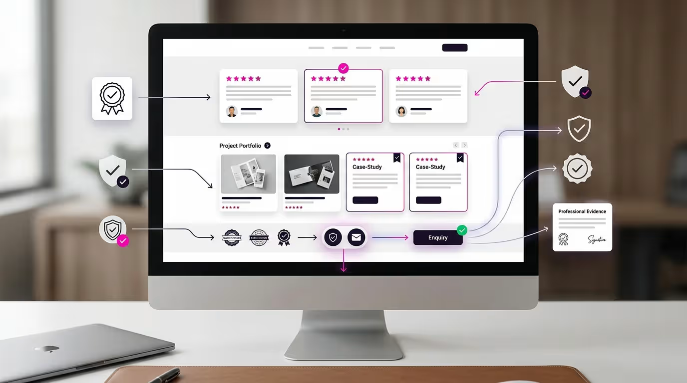
A professional design can create a strong first impression, but visitors still need evidence before they feel confident contacting the business.
Trust is built when the website supports its claims with clear, relevant and verifiable information. This may include:
Customer testimonials
Public reviews
Case studies
Project examples
Certifications
Awards
Industry memberships
Team qualifications
Business registration details
Years of relevant experience
Client or partner logos used with permission
Photographs of actual work, products or facilities
The most useful evidence depends on the type of business and the decision the visitor needs to make.
A corporate buyer may look for project scope, technical capability, industry experience and a reliable working process. A consumer may focus more on reviews, product quality, delivery information and after-sales support.
Use Specific Testimonials Instead of Generic Praise
Testimonials are more persuasive when they describe a particular aspect of the customer’s experience.
For example, a testimonial may mention:
Clear communication
Responsiveness
Understanding of the project requirements
Ease of using the completed website
Support provided during the project
Quality of the design or development work
Generic statements such as “Excellent service” may still be useful, but they provide less context than feedback connected to a specific service or experience.
Testimonials should not be edited in a way that changes the reviewer’s meaning. The website should also avoid adding outcomes, statistics or claims that the customer did not provide.
A public customer review recommends TheRichWeb for its web design and SEO services. This can be presented as customer feedback, but it should not be interpreted as proof that every project will produce the same result.
Match the Evidence to the Relevant Service
Evidence is more effective when it appears near the claim it supports.
For example:
A service page can display a testimonial about that service.
A portfolio section can explain the project scope.
A product page can show certification or compatibility details.
A training page can display approved participant feedback.
A company profile can present verified experience and credentials.
Placing all testimonials on one separate page may limit their impact. Many visitors will not actively search for that page before making a decision.
Relevant evidence can instead appear naturally throughout the customer journey, while a dedicated review or case study page provides additional detail for visitors who want to investigate further.
Turn Project Galleries Into Useful Case Studies
A gallery of attractive screenshots shows visual capability, but it may not explain the business problem or the work completed.
A stronger case study may include:
The type of organisation
The project objective
The required website functions
The design or content challenge
The scope of work
The solution delivered
Approved customer feedback
Screenshots or project images
Businesses must avoid presenting unsupported performance claims. A completed project should not automatically be described as increasing rankings, traffic, enquiries or sales unless verified evidence is available.
In 2025, TheRichWeb completed 27 client web design projects. This statistic demonstrates recent project delivery activity, but it should not be used to suggest that every project achieved identical marketing or commercial results.
Make Trust Signals Easy to Verify
Trust signals should be accurate, current and displayed with enough context.
For example, certifications should include the correct issuing organisation where appropriate. Awards should not be displayed without the year or category. Client logos should be used only with approval and should not imply a relationship beyond the actual work completed.
Businesses should review trust content regularly because outdated certifications, departed team members or broken review links can weaken credibility.
Contact details also function as trust signals. Visitors may feel more confident when they can easily find:
Business name
Telephone number
Email address
Physical location where relevant
Business hours
Contact form
Privacy policy
Terms or service information
The website should make it clear who operates the business and how visitors can reach the team.
Avoid Unsupported Trust Claims
Terms such as “number one,” “leading,” “best” or “most trusted” require strong evidence. Without verification, these claims may sound promotional rather than credible.
A safer and more useful approach is to explain the company’s actual services, process, experience and evidence.
For example:
TheRichWeb provides website design, WordPress development, SEO, website maintenance and related digital support for businesses and organisations.
This is more informative than making a broad claim that cannot be independently confirmed.
Trust is not created by adding more badges or stronger promotional language. It develops when the website presents accurate information, realistic claims and evidence that visitors can understand and verify.
15. Integrate Social Media Without Distracting Website Visitors
Social media can extend a website’s reach, support brand visibility and help visitors discover current updates. However, the website should remain the central platform for presenting services, building trust and generating enquiries.
A common mistake is to treat social media integration as simply placing several icons in the header or embedding a large live feed on the homepage.
Effective integration should help visitors move between the website and social platforms without interrupting the main customer journey.
Useful social media integrations may include:
Links to active social profiles
Social sharing buttons on suitable blog articles
Embedded videos from relevant channels
Selected customer-generated content used with permission
Campaign landing pages connected to social advertisements
Click tracking for visitors arriving from social media
Website links included within social profile descriptions
Product or service pages shared through social campaigns
Keep Important Content on the Website
Businesses should not rely entirely on social platforms to explain their services, products or business information.
Social media content moves quickly and may be difficult for potential customers to search later. Platform algorithms may also limit who sees each post.
The website should contain the core information visitors need, including:
Service descriptions
Product details
Business profile
Contact information
Testimonials and case studies
Frequently asked questions
Enquiry and quotation options
Social media can then direct visitors towards these pages.
For example, a short LinkedIn post may highlight a common business challenge and link to a detailed service page. An Instagram post may introduce a completed project and direct interested visitors to the relevant portfolio or enquiry page.
This creates a clearer path from awareness to evaluation and action.
Avoid Overloading Pages With Live Social Feeds
A live social media feed may help show that a business is active, but it can also slow the website and distract visitors.
Embedded feeds may introduce:
Additional scripts
Slower loading times
Inconsistent visual styles
Content unrelated to the current page
External links that take visitors away from the website
Empty or outdated sections when posting activity stops
A better approach may be to display a small selection of curated posts, campaign images or social proof that supports the page’s purpose.
For example, a training website may show selected workshop photographs rather than embedding an entire social feed. A product website may feature approved customer photos near the relevant products.
Use Social Proof Carefully
Follower counts, comments, shared posts and user-generated content can support credibility, but they should not replace stronger business evidence.
Social proof should be accurate and relevant. Businesses should obtain permission before using customer photographs, comments or posts outside the original platform where required.
Negative, outdated or unrelated social content should not appear automatically on important service or conversion pages.
The website should maintain control over which evidence is displayed and how it is presented.
Create Dedicated Landing Pages for Social Campaigns
Visitors arriving from social media should reach a page that matches the message or offer they selected.
Sending every visitor to the homepage can create unnecessary friction. The homepage may cover several services and may not continue the specific conversation started by the social post or advertisement.
A dedicated landing page can include:
A headline matching the campaign
A concise explanation of the offer
Relevant images or video
Benefits or key details
Trust evidence
A focused form or call to action
Campaign-specific tracking
This creates a more consistent journey from the social platform to the website.
Track Social Media Traffic and Actions
Businesses should measure whether social media visitors complete meaningful actions on the website.
Useful measurements may include:
Landing-page visits
Enquiry form submissions
WhatsApp clicks
Telephone clicks
Downloads
Registrations
Product views
Purchases where applicable
Tracking helps distinguish between social engagement and actual website activity.
A post may receive many likes but generate few website visits. Another post with lower visible engagement may bring visitors who read service pages or submit enquiries.
Both types of information are useful, but they represent different outcomes.
Make Social Links Easy to Find but Secondary
Social profile links can appear in the header, footer, contact page or selected content sections. They should remain easy to locate without competing with primary actions such as requesting a quotation or contacting the company.
Opening external social links in a separate browser tab may help visitors return to the website, although the experience should still be tested across devices.
The purpose of social media integration is not to move visitors away from the website as quickly as possible. It is to connect brand awareness, ongoing communication and campaign activity with a stronger owned digital platform.
When used strategically, social media introduces and re-engages potential customers, while the website provides the structure, depth and conversion path needed to support a business decision.
16. Build SEO, Accessibility and Security Into the Design
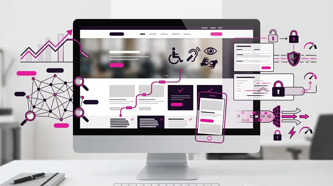
SEO, accessibility and security should be planned during the website design process rather than added only after the site is completed.
These areas affect how easily people can discover, use and trust the website. When they are considered from the beginning, the website structure, content and technical setup can work together more effectively.
Plan SEO Around Website Structure
Search visibility is influenced by more than placing keywords into headings.
A website should have a logical structure that helps both visitors and search engines understand the relationship between pages.
This may include:
A clear homepage
Dedicated pages for important services
Logical product or service categories
Descriptive page titles
Meaningful headings
Internal links between related pages
Clean and understandable URLs
Useful image alternative text
Original content that answers customer questions
Each important service should usually have enough dedicated content to explain the offer properly.
Combining many unrelated services on one page can make the information harder to understand and may limit the website’s ability to address specific search intent.
For example, a business offering corporate website development, online stores and SEO services may benefit from separate pages for each service. Visitors can then access information relevant to their needs, while the website gains a clearer content structure.
SEO planning should also consider how visitors search.
Customers may use terms related to:
A service
A product
A business problem
An industry
A location
A comparison
A cost
A process
A frequently asked question
Website content should address relevant searches naturally without repeating the same keyword unnecessarily.
SEO should not weaken readability. Headings and paragraphs must remain useful to human readers rather than being written primarily for a ranking tool.
Make the Website Accessible to More Users
Accessible design helps people with different visual, hearing, motor and cognitive needs use the website more effectively.
It can also improve the experience for visitors using mobile devices, slower connections, keyboards or assistive technologies.
Practical accessibility considerations include:
Sufficient contrast between text and backgrounds
Readable font sizes
Descriptive link text
Alternative text for informative images
Clear form labels
Keyboard-friendly navigation
Visible focus indicators
Captions or transcripts for important videos
Logical heading order
Error messages that explain how to correct a form
Controls for motion or animation where appropriate
Buttons should explain the action they perform. A link labelled “View Website Design Packages” is more informative than several identical links labelled “Click Here.”
Form fields should have visible labels rather than relying only on placeholder text. Visitors need to understand what information is required before they begin typing.
Heading levels should also follow a logical hierarchy. They are not only visual formatting tools. They help organise the page and allow some users to navigate the content through assistive technology.
Accessibility should be tested, not assumed. Automated checking tools may identify some problems, but manual review is still needed to evaluate navigation, content order, form behaviour and overall clarity.
Protect Visitor and Business Information
Security affects both the website owner and the people using the site.
A business website may collect names, telephone numbers, email addresses, enquiry details, account information or payment data. The website should use suitable safeguards based on the information and functionality involved.
Important security practices may include:
Using an SSL certificate
Keeping WordPress, themes and plugins updated
Removing unused software
Using strong account passwords
Limiting administrator access
Applying appropriate user roles
Maintaining regular backups
Protecting forms from spam and automated abuse
Monitoring suspicious activity
Using reputable hosting
Reviewing third-party integrations
Security measures should be proportionate to the website.
An informational corporate website and an e-commerce platform may have different requirements, but neither should be left unmaintained.
Outdated plugins and themes can introduce vulnerabilities. Installing many unnecessary extensions can also make the website harder to maintain and increase the number of potential failure points.
Website owners should know who has access to the administrative area. Former employees, previous developers or external vendors should not retain access after it is no longer required.
Use Clear Privacy and Consent Practices
Visitors should understand what information the website collects and why.
Depending on the website’s functions, this may involve:
A privacy policy
Cookie information
Consent options
Form notices
Marketing subscription choices
Data retention practices
Third-party service disclosures
A contact form should request only information relevant to the enquiry. Collecting unnecessary personal details creates additional responsibility without necessarily improving the customer journey.
Consent should also be clear. Submitting an enquiry should not automatically subscribe a visitor to unrelated marketing communications without an appropriate choice.
Keep SEO, Accessibility and Security Under Review
These areas require ongoing attention.
Search behaviour changes, website content expands, software is updated and new accessibility or security issues may emerge.
Regular website reviews can check:
Broken links
Missing page titles
Duplicate or outdated content
Slow-loading pages
Unreadable text
Form errors
Expired certificates
Outdated plugins
Unused administrator accounts
Missing backups
Pages that are difficult to use on mobile devices
Website maintenance should therefore include more than changing text or uploading new images. It should help protect the site’s performance, usability and technical condition over time.
A well-designed website should be discoverable, usable and dependable. Building SEO, accessibility and security into the design creates a stronger foundation than attempting to repair all three after problems have already affected visitors.
17. Test, Measure and Continuously Improve Website Performance
A website should not be treated as complete on the day it is launched.
Visitor behaviour, search visibility, campaign activity and business priorities can change over time. Regular testing helps the business identify where visitors experience difficulty, which pages support enquiries and which areas require improvement.
The purpose of measurement is not to collect as much data as possible. It is to understand whether the website is helping visitors complete meaningful actions.
Define the Actions That Matter
Before reviewing website reports, identify the conversions that are relevant to the business.
These may include:
Enquiry form submissions
Quotation requests
Telephone link clicks
WhatsApp clicks
Appointment bookings
Account registrations
Brochure or company profile downloads
Product enquiries
Online purchases
Event registrations
A business should distinguish between general website activity and meaningful outcomes.
For example, a page may receive many visits but generate very few enquiries. Another page may attract less traffic but bring visitors who are more ready to contact the company.
Both pages provide useful information, but they serve different purposes.
Track the Customer Journey
Measurement should help the business understand how visitors move through the website.
Useful questions may include:
Which pages attract new visitors?
Which service pages receive the most attention?
Where do visitors leave the website?
Which calls to action receive clicks?
Do mobile visitors behave differently from desktop visitors?
Which traffic sources generate enquiries?
Are visitors completing forms successfully?
Which pages support paid advertising campaigns?
Do blog readers continue to relevant service pages?
Tools such as Google Analytics 4 and Google Tag Manager can be configured to record selected website actions. The setup should reflect the business’s real objectives rather than tracking every possible interaction.
A visitor scrolling through a page may indicate interest, but a quotation request or completed booking usually represents a stronger business action.
Test Forms and Contact Options Regularly
A visible contact form is not useful if submissions fail, confirmation messages are unclear or notifications do not reach the correct team member.
Businesses should test:
Contact forms
Quotation forms
Booking systems
WhatsApp links
Telephone links
Email links
File uploads
Payment processes
Confirmation pages
Automated email responses
Testing should be completed across desktop and mobile devices.
Forms may stop working after software updates, email configuration changes or security adjustments. Regular testing helps identify these problems before they affect more potential customers.
The confirmation experience also matters. After submitting a form, the visitor should understand that the message was received and what may happen next.
Review Page Performance Individually
Website performance should not be judged only by total traffic.
Each important page has a different purpose.
For example:
A homepage introduces the business.
A service page explains an offer.
A landing page supports a campaign.
A blog article attracts and educates readers.
A contact page facilitates communication.
A product page supports evaluation or purchase.
The appropriate measure depends on the page’s role.
A blog article may be effective when readers continue to a related service page. A landing page may be evaluated through form submissions. A product page may be measured through quotation requests, cart activity or purchases.
Reviewing pages individually helps prevent misleading conclusions based on overall website averages.
Use Testing to Improve Important Elements
Businesses can test changes to elements such as:
Headlines
Hero messages
Calls to action
Button labels
Form length
Page structure
Images
Trust signals
Service descriptions
Navigation labels
Mobile layouts
Changes should be based on a clear problem or question.
For example, if many visitors reach a service page but few select the quotation button, the business may review whether the service is explained clearly, the call to action is visible or sufficient trust evidence is present.
Testing does not always require a complex experiment. Small usability reviews, customer feedback and form testing can reveal practical issues.
When traffic volume is sufficient, structured comparison testing may help evaluate alternative versions of a page element. Results should still be interpreted carefully because seasonality, campaign changes and traffic quality can affect performance.
Combine Data With Human Feedback
Analytics can show what visitors do, but it may not fully explain why they do it.
Customer-facing teams may identify recurring questions that the website does not answer. Sales teams may notice that prospects misunderstand a service. Customers may report difficulty finding a document, completing a form or using the site on mobile devices.
Useful feedback may come from:
Customers
Sales teams
Marketing teams
Customer service staff
Website administrators
Training participants
Suppliers or business partners
Usability testing participants
This information can guide content and design improvements that are not obvious from traffic reports alone.
For example, repeated questions about a service process may indicate that the page needs a clearer process section. Frequent requests for pricing guidance may suggest that visitors need an explanation of how quotations are prepared.
Prioritise Improvements by Business Impact
Not every website issue requires immediate attention.
Businesses can prioritise improvements according to:
The importance of the affected page
The number of visitors affected
The severity of the usability problem
The potential effect on enquiries or sales
The cost and complexity of the improvement
The risk of leaving the issue unresolved
A broken quotation form should normally take priority over a minor visual inconsistency. A difficult mobile menu may be more urgent than updating an image on a low-traffic page.
This approach helps internal teams use budgets and resources more effectively.
Maintain a Continuous Improvement Schedule
Website reviews can be organised into a practical schedule.
Routine checks may include:
Testing forms and contact links
Reviewing page speed
Checking mobile layouts
Updating software
Reviewing security alerts
Confirming backups
Removing outdated information
Checking broken links
Reviewing important conversion data
Updating product or service pages
Evaluating campaign landing pages
The frequency depends on the website’s size, functionality and business importance. An active e-commerce site or campaign platform may require more frequent monitoring than a small informational website.
Continuous improvement does not mean redesigning the website every few months. It means making informed adjustments so the website remains accurate, usable and aligned with business objectives.
A website becomes more valuable when the business can identify what is working, recognise where visitors struggle and make improvements based on evidence rather than assumptions.
How to Prioritise the Right Web Design Ideas for Your Business
Not every business needs to implement all 17 web design ideas at once.
The right priorities depend on the current website condition, business objectives, available budget and the problems preventing visitors from taking action.
A structured review can help separate urgent issues from optional improvements.
Begin With the Main Business Problem
Identify the most important problem the website needs to solve.
Examples may include:
The website looks outdated and weakens brand credibility.
Visitors cannot understand the company’s services.
Mobile users struggle to navigate or complete forms.
Website pages load too slowly.
Marketing campaigns generate visits but few enquiries.
The business has no dedicated pages for important services.
Calls to action are unclear or difficult to find.
Website activity and conversions are not being tracked.
Content, plugins or contact information are outdated.
The website no longer supports the company’s current direction.
The priority should be the issue that creates the greatest risk or prevents the website from supporting an important business objective.
For example, changing colours may improve appearance, but fixing a broken enquiry form or unclear service page may deliver more immediate practical value.
Separate Essential Improvements From Optional Features
Website ideas can be grouped into three priority levels.
Essential Improvements
These directly affect whether visitors can access, understand and trust the website.
They may include:
Mobile responsiveness
Clear navigation
Fast loading
Readable content
Working forms
Website security
Accurate service information
Clear contact details
Accessible buttons and links
Essential issues should normally be addressed first.
Business Growth Improvements
These help the website support marketing, customer education and enquiry generation more effectively.
They may include:
Dedicated service pages
Stronger calls to action
Improved landing pages
Customer journey planning
Case studies
Conversion tracking
SEO content
Better product presentation
Campaign-specific pages
These improvements should be prioritised according to the services, products or campaigns most important to the business.
Enhancement Features
These may improve presentation or convenience but are not always necessary for the website to perform its core role.
Examples include:
Advanced animations
Personalised recommendations
AI chat features
Interactive calculators
Complex filtering tools
Custom illustrations
Extensive video backgrounds
These features should be added only when they support a genuine visitor need and the business has the resources to maintain them.
Review the Most Important Pages First
A complete website review can feel overwhelming, particularly when the site contains many pages.
Begin with pages that have the greatest business value, such as:
Homepage
Main service or product pages
Campaign landing pages
Contact or quotation pages
Pages receiving significant traffic
Pages used by the sales or marketing team
Pages appearing in important Google searches
Improving these pages first allows the business to focus resources where they are more likely to support customer decisions.
A low-traffic article with minor formatting issues may not require the same urgency as a core service page that fails to explain the offer clearly.
Decide Whether to Improve or Redesign
Some websites can be improved through targeted changes. Others may require a broader redesign.
Targeted improvements may be suitable when:
The website structure is still logical.
The technology remains supported.
Most pages are accurate.
Branding is generally consistent.
The main problems involve selected content or layouts.
Forms and integrations can be repaired.
Mobile issues are limited to a few sections.
A complete redesign may be more appropriate when:
The website no longer represents the business.
The structure is confusing across many pages.
The design is consistently outdated.
The platform is difficult to manage.
Mobile usability problems affect the whole site.
Important functionality cannot be added reliably.
Content and navigation require major restructuring.
Technical problems occur repeatedly.
Businesses considering a wider project can review the practical factors involved in planning a website redesign before deciding whether to improve selected sections or rebuild the website more comprehensively.
Prioritise According to Customer Impact
Each proposed improvement should be evaluated according to how it affects the visitor.
Ask:
Will it make the service easier to understand?
Will it reduce confusion?
Will it make the website easier to use on mobile?
Will it help visitors trust the business?
Will it remove a barrier to contacting the company?
Will it support an important campaign or service?
Can its effect be measured?
Can the business maintain it properly?
An improvement that answers several of these questions positively should usually receive greater priority than one that changes appearance without improving usability or communication.
Consider Available Resources
The most ambitious design idea is not always the best starting point.
Businesses should consider:
Available budget
Internal content resources
Photography or video availability
Technical requirements
Staff responsible for updates
Website maintenance capacity
Project timeline
Marketing priorities
For example, a complex personalised website may require ongoing content management, system integration and technical support. A simpler, well-structured website may be more suitable when the business needs a reliable platform that can be maintained consistently.
Startups and growing businesses should select a structure that supports their current needs while allowing additional pages, content and functionality to be added later. This avoids investing in unnecessary features before the business model or customer demand has been validated.
Create a Phased Improvement Plan
A practical website improvement plan may be divided into phases.
Phase 1: Fix critical issues
Address broken forms, security problems, mobile usability, loading speed, incorrect information and navigation problems.
Phase 2: Improve communication
Strengthen the hero section, service pages, calls to action, visual hierarchy and trust evidence.
Phase 3: Support visibility and marketing
Develop SEO-ready pages, campaign landing pages, internal links, tracking and useful content.
Phase 4: Add advanced features
Introduce personalisation, automation, interactive tools or AI features where they provide clear value.
This phased approach helps the business improve the website without trying to complete every idea simultaneously.
The best web design priorities are the ones that solve current visitor problems, support important business goals and create a stronger foundation for future growth.
How TheRichWeb Turns Web Design Ideas Into a Practical Website
Web design ideas become valuable only when they are translated into a website structure that supports real business requirements.
TheRichWeb approaches website projects by connecting design, content, technology and marketing considerations rather than treating each element as a separate task.
Begin With the Business Objective
The first step is to understand what the website needs to accomplish.
Depending on the organisation, the objective may be to:
Strengthen corporate credibility
Explain services more clearly
Generate quotation requests
Support Google Ads or social campaigns
Improve Google visibility
Sell products online
Promote training or events
Provide a professional company profile
Support sales and marketing teams
The objective influences the recommended website type, page structure, content requirements and calls to action.
A startup promoting one focused offer may initially need a landing page. An established organisation with several services may require a structured corporate website. A retailer may need an online store with suitable product categories, payment functions and enquiry options.
The appropriate solution depends on the business model rather than the number of design features that can be added.
Plan the Website Structure
Before designing individual sections, TheRichWeb considers how visitors will move through the website.
This includes identifying:
The primary audience
Important services or products
Main customer questions
Required website pages
Navigation structure
Conversion actions
Supporting trust evidence
Mobile content order
Future content and SEO requirements
A clear structure helps prevent important information from becoming buried inside long pages or confusing menus.
It also creates a stronger foundation for future service pages, blog articles, campaign landing pages and SEO activity.
Connect Design With Content
A page layout cannot solve unclear messaging by itself.
The headline, service explanation, visuals, evidence and call to action need to work together. This is why website copy should be considered during the design process rather than added after every section has already been built.
For example, the size and structure of a hero section depend on:
The value proposition
Supporting message
Primary action
Relevant visual
Trust information
Similarly, a service page layout depends on how much information visitors need before requesting a quotation.
TheRichWeb provides website design and SEO copywriting support where required, helping businesses structure content around clarity, search intent, credibility and lead generation.
Build With Responsive Website Technology
TheRichWeb develops websites using WordPress and Elementor, depending on the agreed project requirements.
This allows businesses to manage a practical website structure that may include:
Corporate pages
Service pages
Landing pages
Product information
Online store functions
Enquiry forms
Blog content
Testimonials
Project portfolios
Contact and quotation features
The website should remain responsive across desktop, tablet and mobile devices.
Responsive development includes more than reducing the width of a desktop layout. Text sizes, section order, images, buttons, menus and forms should be adjusted so visitors can use the website comfortably on smaller screens.
Consider SEO During Development
SEO should influence the website structure and content from the beginning.
This may include:
Creating dedicated pages for important services
Using clear page titles and headings
Structuring content around customer questions
Optimising internal links
Preparing meaningful image alternative text
Improving page speed
Ensuring mobile usability
Creating space for future blog content
Setting up suitable tracking tools
These practices provide a foundation for ongoing optimisation, but they do not guarantee specific Google rankings or a fixed timeline.
Search visibility depends on many factors, including competition, website quality, content relevance, technical condition and continued optimisation.
Add Appropriate Hosting and Maintenance Support
A website requires continued technical attention after launch.
TheRichWeb provides support involving:
Domain registration
Web hosting
SSL
Website maintenance
WordPress updates
Technical troubleshooting
Content updates
Website performance review
Maintenance requirements depend on the size and functionality of the website.
An online store, membership platform or actively promoted campaign site may need more frequent attention than a small informational website.
Ongoing support helps the business keep important software, content and website functions current, but the scope should be defined clearly according to the selected service.
Configure Measurement Around Business Actions
A website should provide useful information about how visitors interact with important pages and conversion points.
Where required, Google Analytics 4 and Google Tag Manager can be configured to measure actions such as:
Form submissions
WhatsApp clicks
Telephone clicks
Quotation requests
Registrations
Downloads
Product or checkout activity
Tracking should be planned according to the business’s actual objectives.
Collecting large amounts of data without defining what matters can make reports harder to interpret. A focused measurement plan helps the business evaluate relevant pages, campaigns and visitor journeys more effectively.
Deliver a Website That Can Develop With the Business
A practical website should support current needs while allowing future improvements.
This may include adding:
New service pages
Product categories
Campaign landing pages
Blog articles
Case studies
Tracking events
Online store functions
Training registrations
Additional enquiry workflows
The website does not need every possible feature at launch.
A scalable structure allows businesses to begin with the functions they genuinely need and expand when customer demand, marketing activity or operational requirements justify further development.
In 2025, TheRichWeb completed 27 client web design projects. This reflects recent website design and development activity, but it does not imply that every project had the same scope or produced identical business outcomes.
The central objective is to turn suitable web design ideas into a website that communicates clearly, works across devices and supports the organisation’s wider business and marketing activities.