

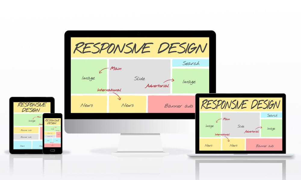
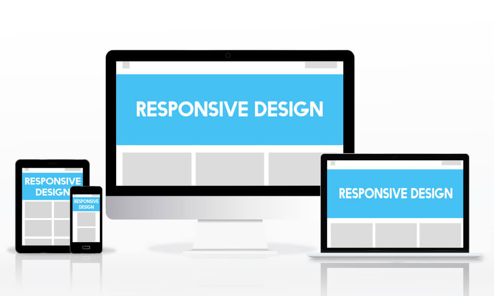
Have you ever wondered if the web design of your web design responsive? How does it work?
If you are wondering, a responsive web design shall instantly adapt to various viewport and screen sizes. If your website is the web design responsive type, it will appear great and work flawlessly on every device used to visit it. Web design responsiveness are important for every web design agency.
7 reasons on why web design responsive is important;
1. Enhancing user experience
Regardless of the device being used, responsive web design makes sure that materials are displayed in an ideal and readable way. This helps users to be more engaged and satisfied because they don’t have to zoom in, scroll horizontally, or fight with tiny buttons while visiting your website.
2. Rising mobile usage
People nowadays access the internet primarily through mobile devices like smartphones and tablets. So, with a good web design responsive, your website can automatically adjust to mobile screen sizes and provide a more mobile-friendly user experience.
3. Time and resource efficiency
A separate mobile version of a website might take a lot of time and cost to develop. You can manage a single website that automatically adapts to various devices thanks to responsive design, doing away with the need for duplicating content, separate maintenance, and updates. Long-term, this saves both time and resources.
4. SEO (search engine optimisation)
Mobile-friendly websites are preferred by search engines like Google and frequently appear higher in search results, especially when following web design principles that prioritise usability and accessibility. Additionally, web design responsive actually assists in avoiding problems like duplicating content that can harm SEO. So if you’re planning to grow with SEO marketing, make sure to have a responsive web design okay?
5. Future-proofing
Web design responsive also enables websites to adjust to rapid technology changes without needing a full redesign or reconstruction.
6. Better conversion rates
Conversion rates may be positively impacted by a responsive website that offers a consistent user experience across devices. Users are more likely to stay longer, explore farther, convert into customers, or perform the intended actions if they can browse, read, and interact with the material with ease.
7. Social media sharing
Content sharing is a crucial component of online presence in the age of social media. Regardless of the device that the recipients are using, responsive design makes sure that shared links provide an optimised experience. As a result, there is a higher chance of interaction and greater sharing is encouraged.
So, what are the tips to achieve a responsive web design?
1) Mobile-first approach: Since mobile devices have smaller screens, build for them first. This strategy makes it easier to prioritise material and guarantees a seamless experience on smaller displays.
2) Fluid grids: To design adaptable grid systems that fit different screen widths, use relative measures like percentages or viewport-based units (like vw and vh). Avoid using set pixel widths!
3) Flexible images and media: To ensure that images and media elements scale proportionately within their containers, use CSS strategies like max-width: 100%. Also, use responsive images that can adjust their size to the capability of the device.
4) Using media queries: You may apply various CSS styles depending on the features of a given device, such as its screen size, resolution, and orientation. You can specify the breakpoints at which the design adjusts to fit various screen sizes using media queries.
5) Breakpoints: Based on typical device sizes, identify your design’s breakpoints and make necessary adjustments to the layout, typography, and other elements at those points. This guarantees the best possible presentation across all screen sizes.
6) Flexible typography: To guarantee that text scales appropriately across many devices, use relative units for font sizes (such as em or rem). Take into account the legibility on smaller displays, line height, and letter spacing.
7) Responsive navigation: Design navigation menus that extend into a dropdown or collapse into a hamburger menu on smaller displays to conserve space. Make sure the mobile menu is simple to use and accessible.
8) Touch-friendly elements: Ensure that interactive elements, including buttons and links, are sufficiently big and spaced apart to allow for accurate touch input on mobile devices.
9) Performance optimisation: To enhance the performance of your responsive website, optimise pictures, cut down on code, and lower server requests. Think about utilising caching methods and lazy loading of pictures.
10) Test your website across devices: To make sure your website’s web design responsive properly, test it using a variety of devices and screen sizes! This approach can be aided by emulators, device labs, and testing tools for responsive designs.
Are there any examples of websites with web design responsive in Malaysia?
Well, the answer is definitely yes! One of the most known websites to have a responsive web design is Maybank.
Maybank, one of the largest banks in Malaysia, does have a responsive web design. The website adjusts smoothly across various devices, providing users with a consistent and optimised experience.
Whether you are using a desktop, tablet, or mobile device, Maybank’s website layout, navigation, and functionality adjust to offer easy access to banking services. Go and give it a browse today!
No idea on how to own a web design responsive?

To start, you may follow some of our tips to achieve a responsive web design ideas as stated in our sharing above. If you are too busy or have zero ideas on how to do so, we are always here to assist!
Therefore to all individuals, corporate businesses, and entrepreneurs out there who are seeking for the best web design responsive services, and looking for fresh web design ideas, make sure to contact us or WhatsApp us up today for further information with The Rich Web.


